Well, we completed the step of collecting data in a DynamoDB table. Here is a list of related posts, as I decided to break the project into stages.
- Building a Sentiment Analysis Pipeline on AWS (before)
- High-Performance Sentiment Analysis Pipeline with SQS and Lambda (before)
- From Feedback to Insights: Sentiment Analysis with Athena and QuickSight (after)
The next phase of the project is visualizing this data in QuickSight. However, before diving into the QuickSight integration, let’s start by creating a draft and prototypes of the analysis using Pandas. This will help us better understand the data structure and uncover key trends before moving on to more advanced visualization tools.
Proportion of Feedback Categories
The first step was to understand the distribution of feedback categories. I created a pie chart that shows the proportion of each feedback type—for example, product-related issues, app experience, or customer service queries.
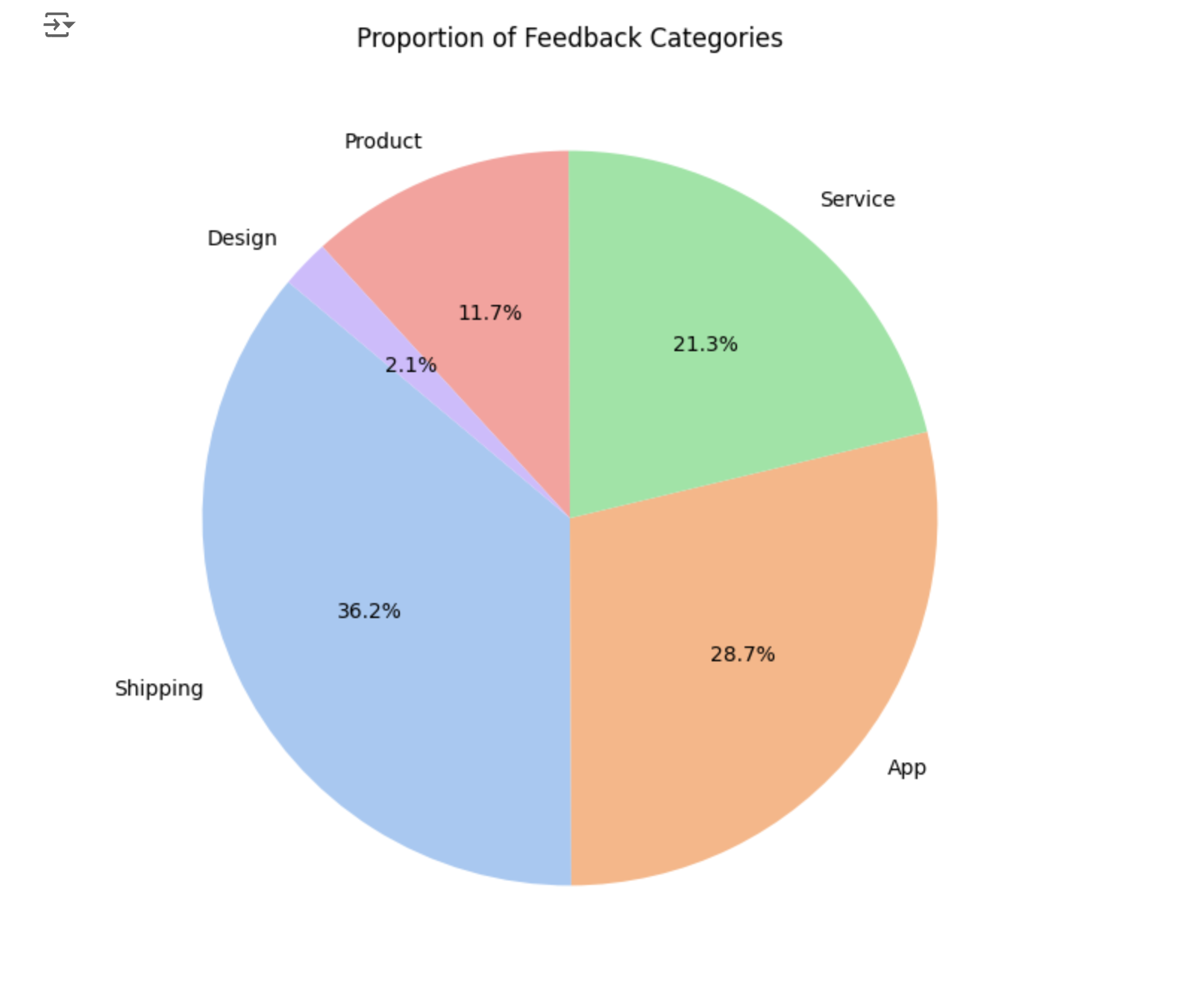
Why It Matters
This visualization answers: What are customers most concerned about?
If one category dominates, it signals where to focus attention, such as addressing bugs in a product or improving support workflows.
Sentiment Distribution Across Feedback
Next, I analyzed the overall sentiment of the feedback. By dividing entries into positive, neutral, and negative categories, I created another pie chart to show how customers feel about the service overall.
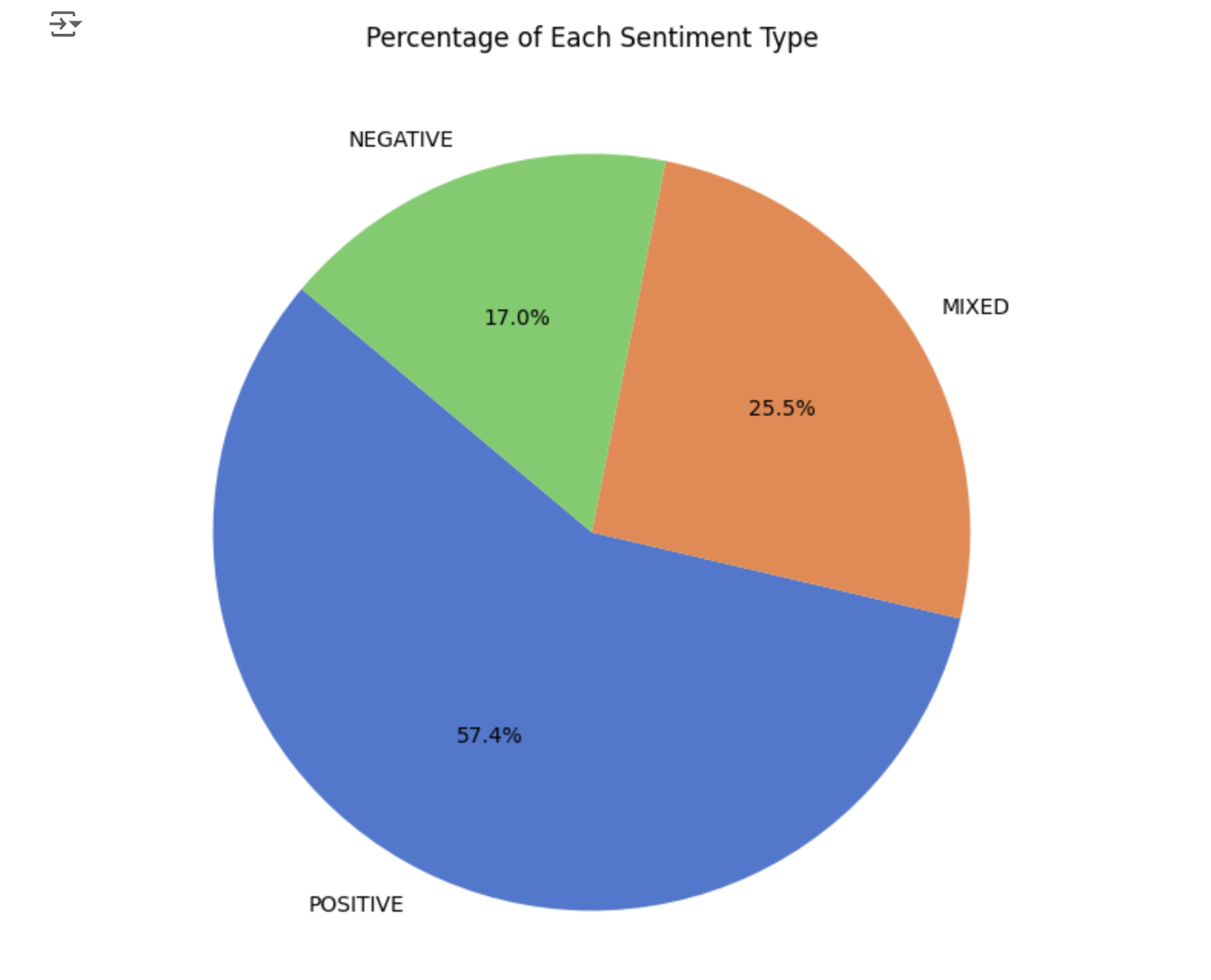
Why It Matters
A high percentage of negative feedback is an early warning sign for customer dissatisfaction. Conversely, a strong positive sentiment reflects that the product or service resonates well with users.
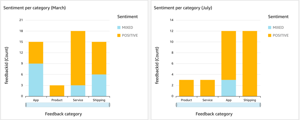
Monthly Sentiment Trends
To dive deeper, I added a timeline by extracting the month from the feedback timestamps. With this, I created a line chart to show how the number of positive, neutral, and negative feedback changes over months.
Actually, I generated synthetic feedback but asked the generator to include certain trends to create the appearance of real feedback. It partially succeeded in its task, and we can observe a spike in negative feedback in September. This warrants a closer look at the specific product category involved. Additionally, in March and July, we see peaks in positive feedback.
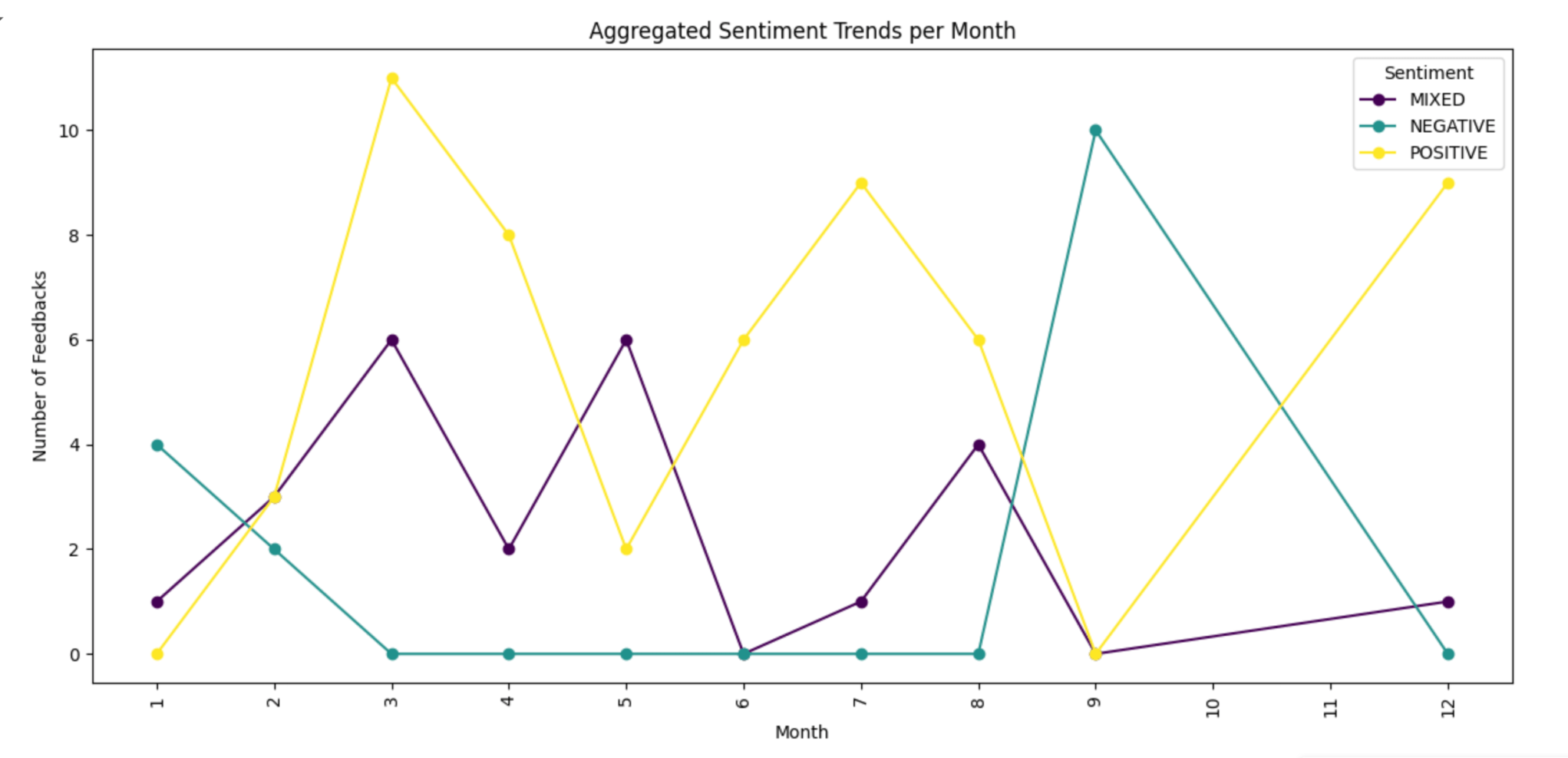
Why It Matters
This chart answers: Are there seasonal trends in customer sentiment?
Spikes in negative feedback might correlate with events like product launches, outages, or marketing campaigns. Identifying these patterns allows teams to prepare or address underlying issues.
Sentiment Trends by Category
Breaking the monthly sentiment trends down by category adds another layer of insight. Each category now has its own timeline, showing how sentiment evolves over months. Here are example graphs for two categories. Now we can see that the spike in negative feedback in September was contributed to by categories such as service and shipping.
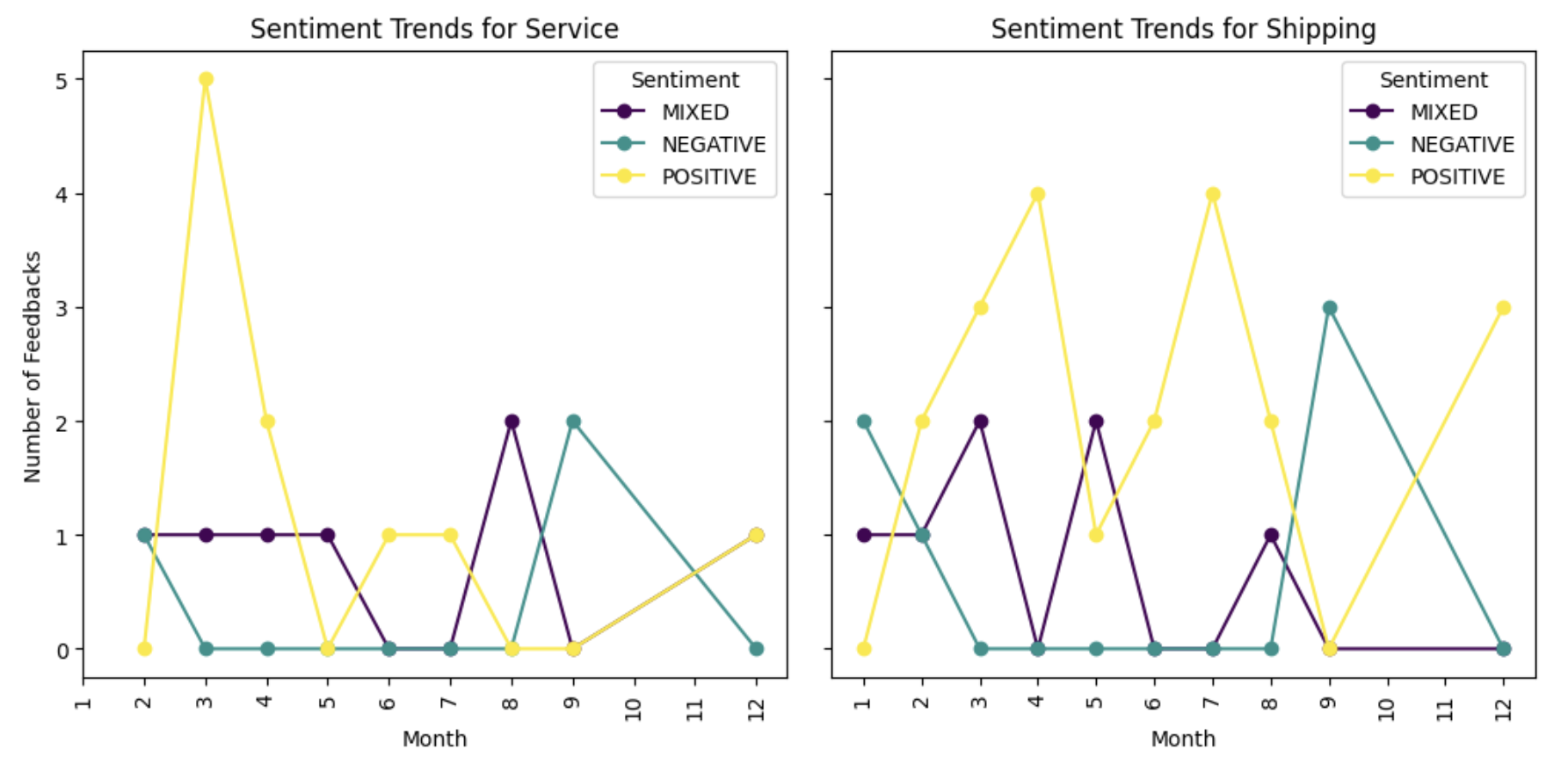
Why It Matters
This chart helps identify which areas drive overall sentiment changes. For example, negative feedback spikes in one category—say, app performance—might indicate an issue that doesn’t affect other parts of the business.
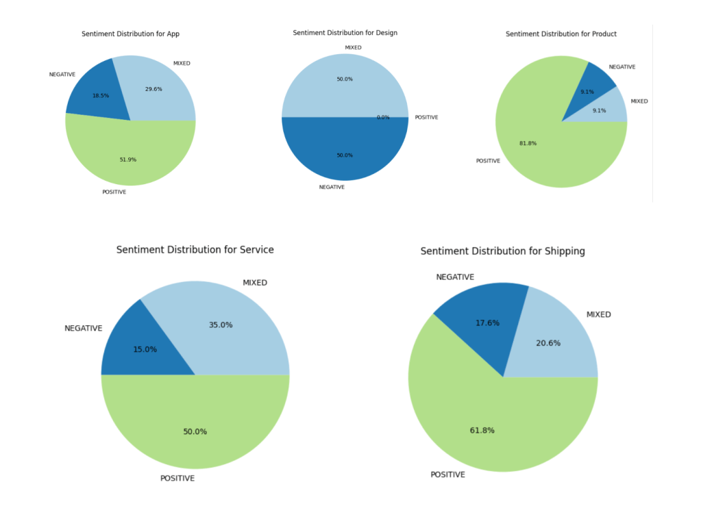
Sentiment Distribution Within Categories
Finally, I examined sentiment proportions within each feedback category. For example, in the “Product Features” category, what percentage of feedback is positive, neutral, or negative?

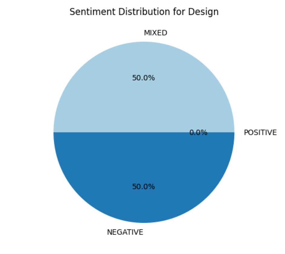

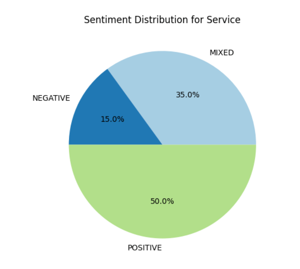
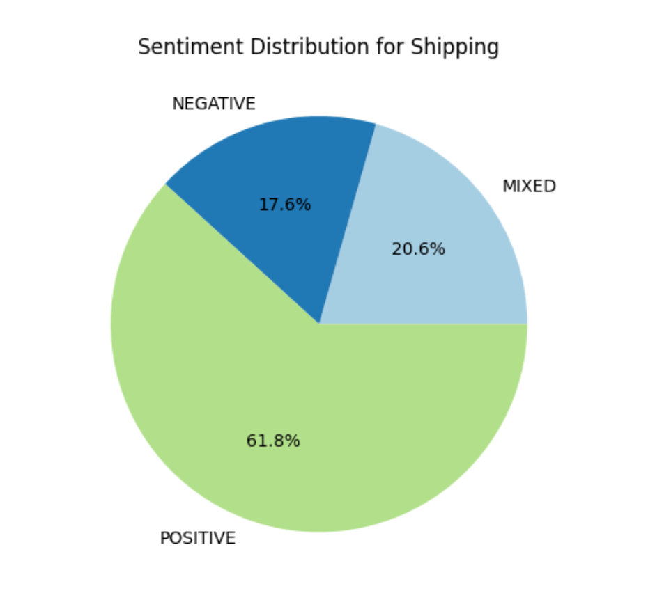
Why It Matters
This visualization is like a health check for each category. A category with predominantly negative feedback might need immediate attention, while one with balanced sentiment suggests a mix of experiences.
Conclusion
This exercise is just the beginning. By visualizing feedback data, we can prototype insights that bridge engineering and business analysis. These charts help identify patterns, highlight areas of concern, and guide priorities.
The next step is to move from prototypes to production-ready dashboards. In the following article, I’ll explain how to use Amazon QuickSight and Athena to automate these visualizations and make them accessible to teams in real time.


Leave a comment