Well, we’ve wrapped up implementing sentiment extraction in two architectures—one using Step Functions and the other with SQS and Lambda. You can find the descriptions of the previous steps in the project in the following articles:
- Building a Sentiment Analysis Pipeline on AWS 𓊍
- High-Performance Sentiment Analysis Pipeline with SQS and Lambda 🚀
- Prototyping Insights from Customer Feedback with Pandas 📊
Now it’s time to take things further by visualizing the feedback data in QuickSight. At first glance, directly connecting QuickSight to DynamoDB might seem like a straightforward option. However, DynamoDB isn’t designed for analytical queries, especially when it comes to groupings and aggregations. These operations can quickly become inefficient and costly in a NoSQL database like DynamoDB, as it’s optimized for fast lookups rather than complex analytics.
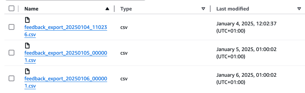
That’s why we’ve chosen to integrate with Athena instead. By exporting feedback to S3 in CSV format, Athena enables us to perform efficient groupings and aggregations. To achieve this, we’ve set up a simple cron job that exports feedback data daily. Each export is timestamped for easy organization. Currently, this exporter is implemented in the SQS version of the project, but it can easily be migrated to Step Functions if needed.
Setting Up Athena for Querying Exported Feedback Data
Once the necessary permissions are set up, the next step is to create an external table in Athena to query the feedback data stored in your S3 bucket. To do this, you can use the following SQL statements:
CREATE DATABASE feedback_db;To create database. Next code defines the schema for the feedback_table in Athena, mapping the fields of the feedback data (such as feedbackCategory, feedbackId, sentiment, timestamp, and month) to their corresponding data types. It specifies the delimiter used in the CSV file (, for fields and \n for lines), and points to the S3 location where the exported data is stored. By using this external table, Athena can efficiently query the data directly from S3 without needing to load it into its internal storage.
CREATE EXTERNAL TABLE IF NOT EXISTS feedback_table (
  feedbackCategory STRING,
  feedbackId STRING,
  sentiment STRING,
  timestamp STRING,
  month INT
)
ROW FORMAT DELIMITED
FIELDS TERMINATED BY ','
LINES TERMINATED BY '\n'
LOCATION 's3://feedback-exports-20250103/';
As part of the export job, I decided to precalculate the month field rather than calculating it dynamically in QuickSight. This decision was made to optimize the analysis process by offloading the calculation to the export job itself, improving performance and simplifying subsequent queries in Athena and QuickSight.
Creating Visuals in QuickSight for Feedback Analysis
In the prototyping phase, we aimed to explore several key insights from the feedback data, including:
- Proportion of Feedback Categories
- Sentiment Distribution Across Feedback
- Monthly Sentiment Trends
- Monthly Sentiment Trends by Category
- Sentiment Distribution Within Categories
Well, now let’s implement the same visualizations in QuickSight, which is a powerful business analytics service that allows you to easily create interactive dashboards and data visualizations from various data sources like Athena.
- Log in to QuickSight and navigate to the dashboard.
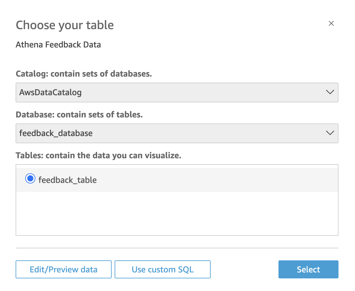
- Create a new Data Source by selecting Athena as the source type and connecting it to your Athena database.
- Create a new Dataset from the chosen Athena table.
Well, now let’s create the Feedback Categories and Sentiments visualizations in QuickSight.
Feedback Categories and Sentiments in QuickSight
To visualize the Proportion of Feedback Categories in QuickSight:
- Add a new visual and choose the Pie Chart type.
- Drag the
feedbackCategoryfield to the Group by field. - Drag any measurable field (e.g.,
feedbackId) to the Value field and set it to count. - Customize the chart with labels and colors as needed.
The same instructions apply for Sentiment Distribution Across Feedback, except this time, you would drag the sentiment field to the Group by field to visualize sentiment distribution across the feedback.
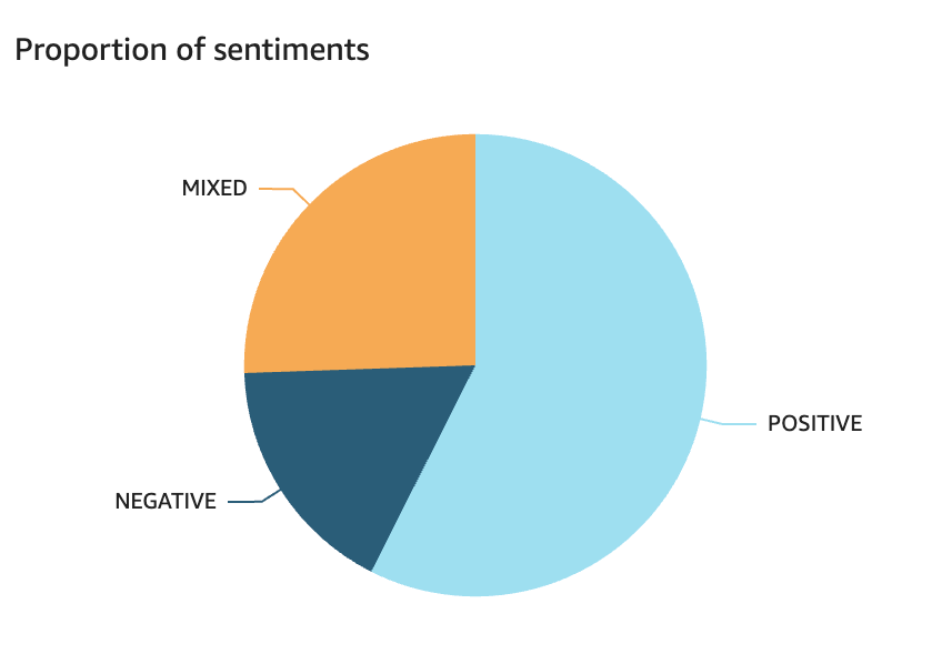
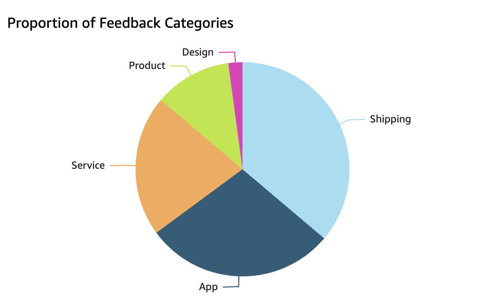
I generated synthetic review data but requested the generator to incorporate specific trends to make it resemble real feedback. As a result, we can observe that, in general, users are satisfied with our product, and there is little mention of the Design category 😊
Now, let’s create the Monthly Sentiment Trends and Sentiment Trends by Category visualizations in QuickSight.
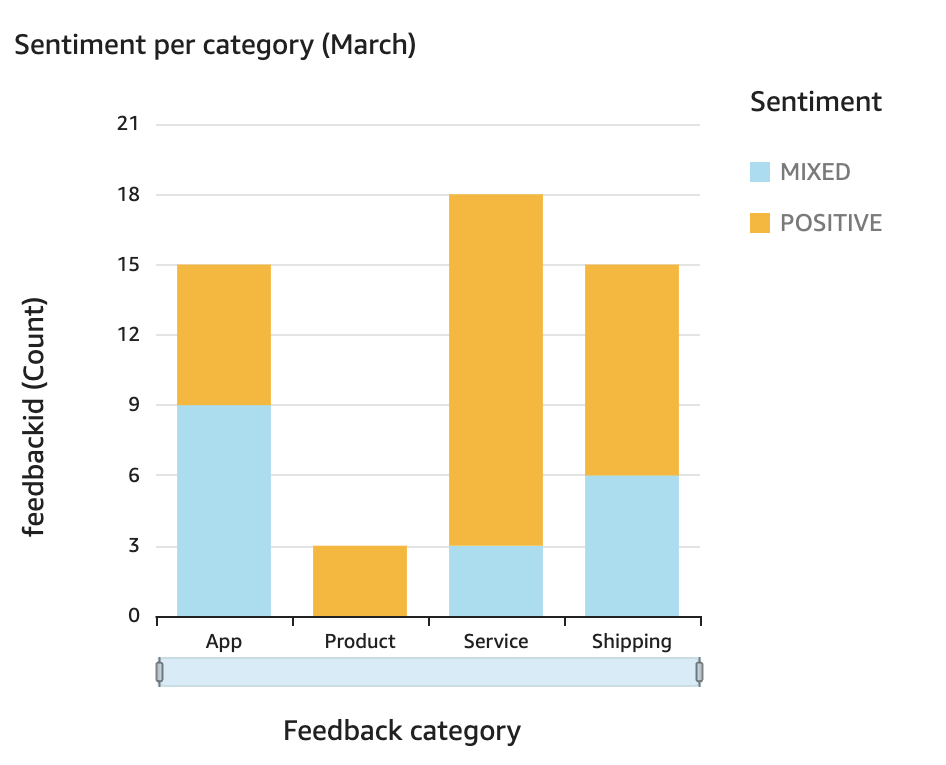
Monthly Sentiment Trends in QuickSight
To visualize Monthly Sentiment Trends in QuickSight:
- Add a new visual and choose the Vertical Stacked Bar Chart type.
- Drag the
monthfield to the X-axis. - Drag the
feedbackIdfield to the Value field and set it to count. - Drag the
sentimentfield to the Color field to differentiate the sentiments. - Customize the chart with labels, titles, and colors as needed.
This will show how sentiments evolve over time, with separate lines representing positive, neutral, and negative feedback over each month. This step aligns with our initial plan of showing a time trend for sentiment across all categories.

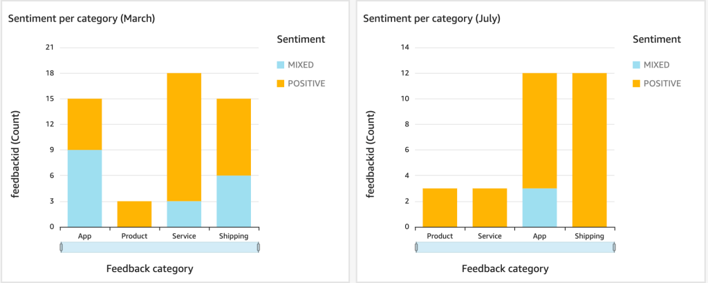
Sentiment Trends by Category
For Sentiment Trends by Category, I initially planned to display separate line charts for each category over year period. However, I decided to display sentiment by categories for each individual month, which allows for a more detailed analysis of how sentiment varies across different categories over time. To create this visualization:
- Add a new visual and choose the Vertical Stacked Bar Chart type.
- Drag the
feedbackCategoryfield to the X-axis. - Drag the
feedbackIdfield to the Value field and set it to count. - Drag the
sentimentfield to the Color field to group by sentiment. - Add a filter for the
monthfield to select a specific month. - Customize the chart with labels, titles, and colors as needed.

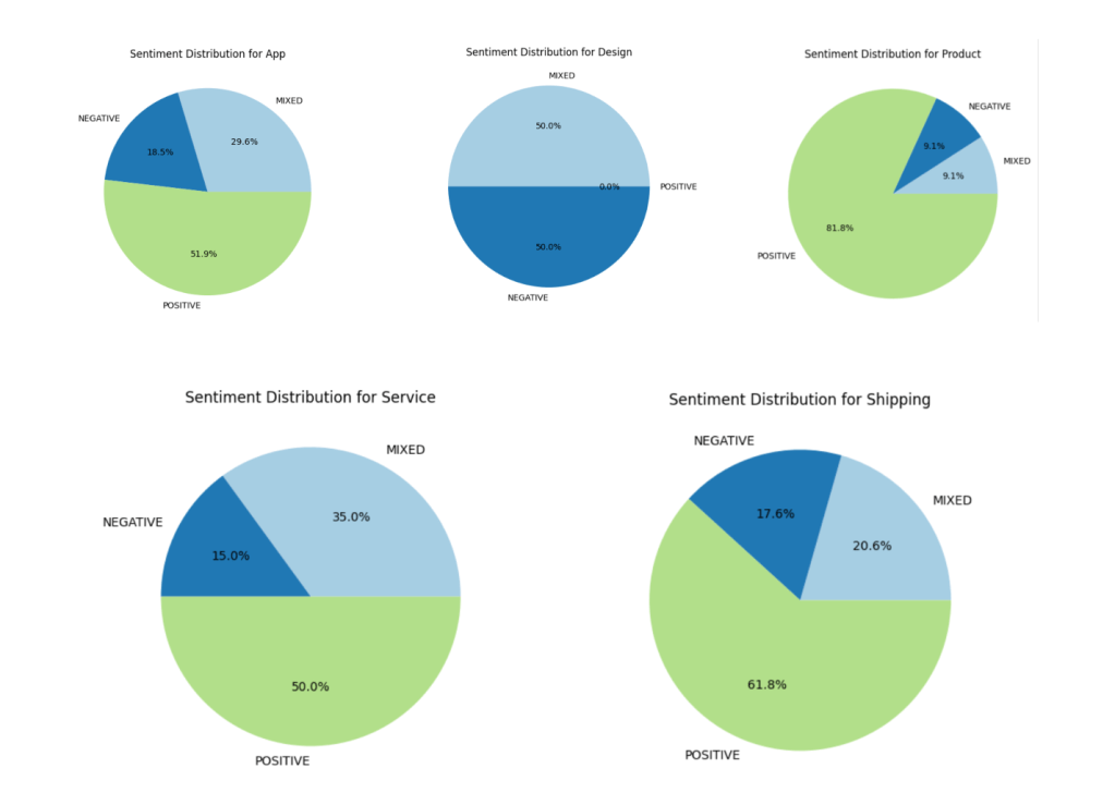
Sentiment Distribution Within Categories in QuickSight
For Sentiment Distribution Within Categories, we focused on visualizing the sentiment breakdown within a specific category. To create this visualization in QuickSight:
- Add a new visual and choose the Pie Chart type.
- Drag the
sentimentfield to the Group by field. - Drag the
feedbackIdfield to the Value field and set it to count. - Add a filter for the
feedbackCategoryfield to select the category you want to analyze. - Customize the chart with labels and colors as needed.
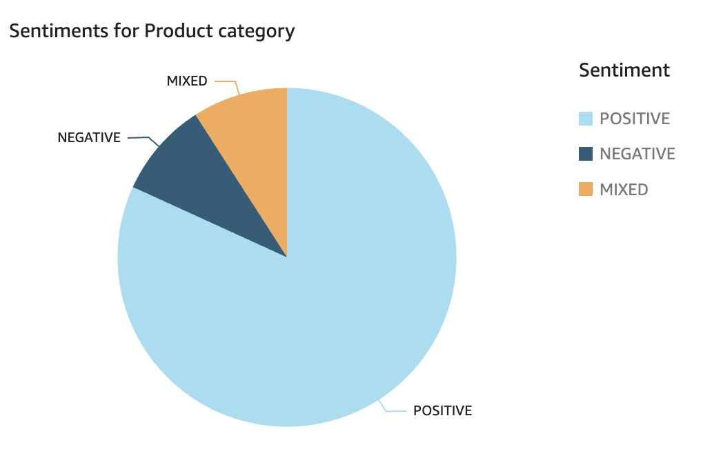
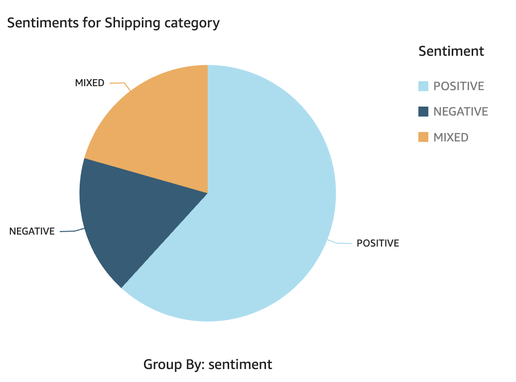
This chart helps us quickly assess the sentiment within a chosen category, highlighting areas that may need attention.
Conclusion
We completed the project by retrieving feedback from the S3 bucket, extracting sentiment data into DynamoDB, and visualizing the results in QuickSight via Athena. Hooray! 👌


Leave a comment